
Custom dashboards that turn data into decisions.
Your business already produces the numbers that matter — they're just scattered across tools and spreadsheets. A custom dashboard brings them into one clear view, built around how your team actually works.
Armatir is a founder-led Alberta studio working remotely with clients across Canada, the United States, Europe, and international markets. Dashboards built as decision-support tools — not just charts, but the view your team checks first.
For teams flying on scattered data.
If the real picture lives in five tabs and a spreadsheet export, a dashboard pays for itself fast.
Operators running on spreadsheets
The morning starts by pulling numbers from several systems and stitching them into one view by hand.
Owners flying blind
You decide on gut feel because the data exists but is too scattered to actually use day to day.
Teams that need shared visibility
Different roles need different views of the same truth — without exporting a spreadsheet for every request.
One clear view of what matters.
Pulled from your real data sources, designed for the people who use it daily.
- Unified data view
- Sales, operations, and reporting data from multiple sources brought into one place, on one screen.
- Connections to your sources
- Connectors to CRMs, spreadsheets, payment tools, and databases so the dashboard reflects real data.
- Role-based views
- Owner, operations, and finance each see the view built for them — not one cluttered screen for everyone.
- Real-time or scheduled refresh
- Live where it matters, scheduled where it doesn't — you choose how current each number needs to be.
- Reporting & summaries
- Scheduled reports and plain-language summaries so the dashboard tells you what changed, not just what's true.
- Filtering & drill-down
- Start at the headline number and drill into the detail behind it without exporting anything.
Decision-support, not just charts.
A dashboard should answer the questions you actually ask — and surface the ones you should.
Starts with the decisions
We design around the questions you ask every week, so the most important number is never buried.
Your data, your view
Built on your actual sources and tailored to how your team works — not a generic BI template.
Fast and focused
A clean, quick dashboard that surfaces the signal — not a bloated platform you pay for and never fully use.
Built for trust
Clear definitions and reliable refreshes so the team trusts the numbers enough to act on them.
From scattered data to one screen.
A focused build around the metrics that actually drive your decisions.
Discovery
We map the decisions you make, the data behind them, and where that data currently lives.
Data & design
Source connections and dashboard layout agreed up front, around the metrics that matter most.
Build & review
The dashboard is built, connected, and refined with you until the numbers are right and clear.
Launch & support
Go live with access control and documentation, plus support as your reporting needs grow.
See a working dashboard in action.
An interactive operations-dashboard demo — the kind of decision-support tool this page describes.
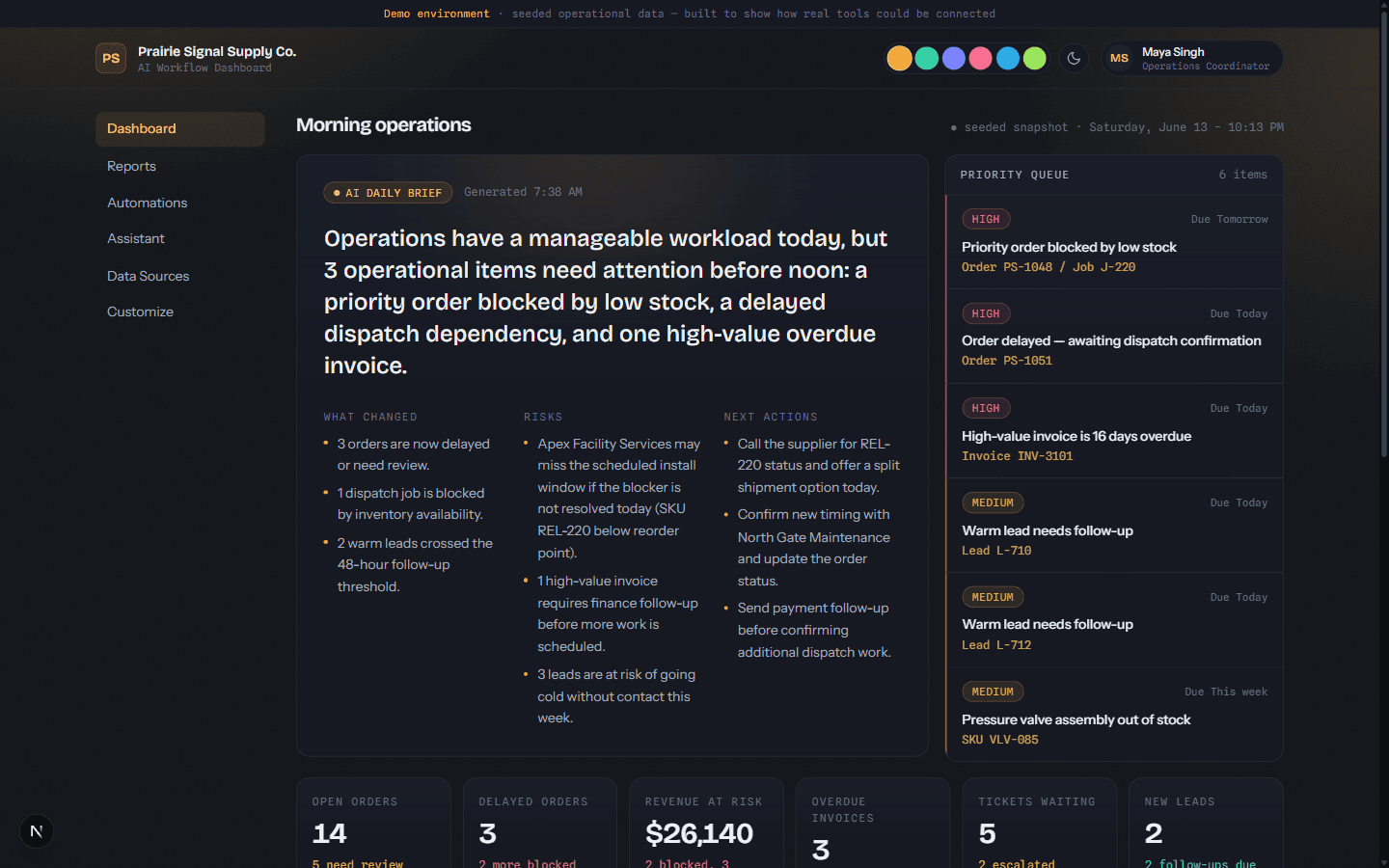
Prairie Signal Supply Co.
A clickable operations dashboard: an AI daily brief, a ranked priority queue, scheduled reports, and a bounded assistant that answers from the underlying records.
Explore the Prairie Signal dashboard, the Nexus workflow demo, or browse the full portfolio.
Straight answers, before you reach out.
Do you build dashboards for businesses outside Canada?
What data sources can you connect to?
Is this like Power BI or Tableau?
Can different people see different things?
How much does a dashboard cost?
Let's build something that actually works.
Clear communication and practical digital systems for small businesses — built around real business goals and maintained as they change.